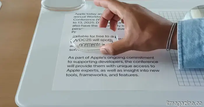
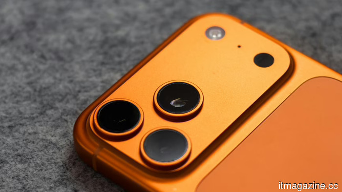
The Liquid Glass slider in iOS 27 appears straightforward, but it's actually more beneficial than I anticipated.
Let's be truthful: few design alterations in iOS have ignited as much discussion as Liquid Glass. When Apple first unveiled it with iOS 26, the online community quickly divided into two factions. Some users embraced the new, translucent aesthetic, while others disliked it, arguing that it made certain parts of the interface more difficult to read. I found myself firmly in the first group. At that time, I owned an iPhone 14 Pro Max, and the first thing I did was install the update. I appreciated how the new design rendered iOS more modern and dynamic. The transparency effects provided a sense of depth to the interface, revitalizing the overall experience.
However, it’s understandable why not everyone shared my enthusiasm. Following months of feedback, screenshots, opinions, and ongoing discussions online, Apple ultimately responded by offering users greater control. Instead of imposing a singular look, they introduced options allowing users to choose between a clearer glass effect and a more muted tone. With iOS 27, Apple places the Liquid Glass debate entirely in your hands. A new slider allows you to tailor the effect to your preferences, whether you lean toward a crystal-clear appearance or something gentler on the eyes. Here’s what the feature does and how you can optimize it on your iPhone.
The slider that resolves the debate
The Liquid Glass slider is essentially Apple’s means of letting you choose how much of the new design language you wish to see. In practical usage, this means you can customize the experience to suit your tastes. If you’re like me and enjoy the complete Liquid Glass vibe, you can keep the transparency high, allowing your wallpaper to shine through menus, widgets, and system panels. This gives iOS a lighter, more layered sensation that effectively showcases the design Apple has aimed for.
On the flip side, if you find that level of transparency distracting or simply favor a cleaner look, you can increase the tint. Doing so enhances the robustness of interface elements and improves contrast, making text and buttons easier to read at a glance. What I appreciate most is that Apple no longer considers customization as a binary choice. You don’t have to embrace Liquid Glass as designed by Apple, nor do you have to disable it entirely. The new slider enables you to discover a balance that suits your eyes and style, making iOS feel more personalized.
Beginning the journey to Liquid Glass
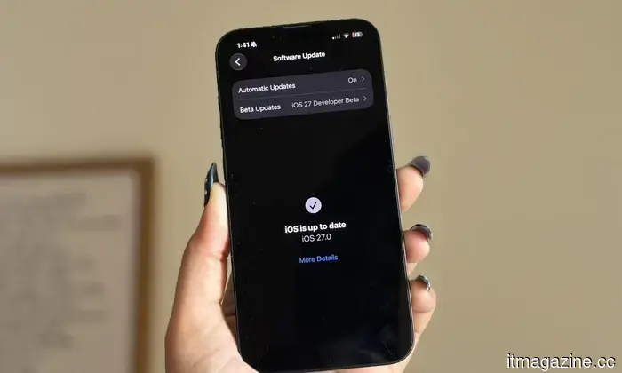
Before adjusting the Liquid Glass slider, you’ll need to have access to iOS 27. I've been testing the feature on my iPhone 16e through Apple's developer beta, which is currently the only way to experience it. If you're comfortable using beta software, getting started is quite simple. Anyone can enroll in Apple's developer program for free and access the latest developer builds. After signing up, open the Settings app, go to General, tap Software Update, and select Beta Updates. Choose the iOS 27 Developer Beta from the list, and the update should appear on your iPhone shortly.
That said, beta software isn’t suitable for everyone. Early builds can sometimes be buggy, and certain apps may not function as expected. If your iPhone is your main device and you'd prefer to avoid pre-release software risks, it's perfectly fine to wait. The good news is that the wait shouldn't be overly long. Apple will eventually roll the feature out to everyone through the public release of iOS 27, so if you prefer a more stable experience, it may be wise to hold off a bit longer.
Time to experiment with the slider
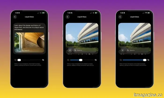
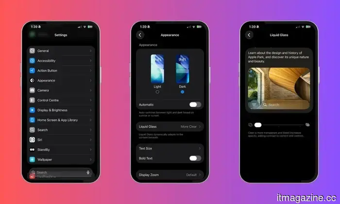
Adjusting the Liquid Glass effect is surprisingly easy. Once your iPhone is running iOS 27, open the Settings app and look for the Appearance section. From there, tap Liquid Glass to access the new customization controls. This is where you'll find Apple's Liquid Glass slider. Unlike the previous setup, which limited you to a few preset appearances, the slider provides much finer control over the effect. The best part is you don't have to guess what each setting does, as the interface updates instantly as you adjust it.
I spent some time moving the slider back and forth to observe how different parts of iOS reacted. Sliding it toward one end makes menus, panels, and interface elements more transparent, allowing your wallpaper and background content to show through. Moving it in the opposite direction adds more tint and contrast, giving the interface a cleaner and more solid look. There’s no right or wrong setting, which adds to the feature's utility. You can leave it at either extreme or find a middle ground if you seek a balance between aesthetics and readability. As you adjust the slider, iOS previews the changes in real time, making it easy to find a look that resonates without constantly switching between menus. My advice is to take your time. Experimenting with different levels of transparency and tint might lead you to discover how much a minor adjustment can transform the overall feel of your iPhone.
The best look for your iPhone is the one you pick
One aspect I've always valued about
Other articles
 Apple's design studio has seen almost all of the designers from the Jony Ive period leave. The new CEO, John Ternus, claims he will address this issue.
Incoming Apple CEO John Ternus is getting ready for a significant overhaul of the design team, which has seen the departure of Ive, Hankey, Dye, and almost all of its senior designers over the past ten years.
Apple's design studio has seen almost all of the designers from the Jony Ive period leave. The new CEO, John Ternus, claims he will address this issue.
Incoming Apple CEO John Ternus is getting ready for a significant overhaul of the design team, which has seen the departure of Ive, Hankey, Dye, and almost all of its senior designers over the past ten years.
 Mrs. Dow Jones states that the American dream is "extremely dead" for young Americans.
Financial influencer Haley Sacks states that millennials and Gen Z are moving away from conventional wealth-building methods in favor of gambling and side hustles due to rising housing expenses.
Mrs. Dow Jones states that the American dream is "extremely dead" for young Americans.
Financial influencer Haley Sacks states that millennials and Gen Z are moving away from conventional wealth-building methods in favor of gambling and side hustles due to rising housing expenses.
 Soft pings will occur, each accompanied by notes.
Smart rings, glasses, earbuds, and glucose patches are transforming everyday life into a series of reminders, alerts, and small adjustments.
Soft pings will occur, each accompanied by notes.
Smart rings, glasses, earbuds, and glucose patches are transforming everyday life into a series of reminders, alerts, and small adjustments.
 Microsoft's June update addressed 208 security vulnerabilities while simultaneously introducing a series of new bugs across all versions of Windows.
KB5094126 addressed 208 security vulnerabilities but brought about issues that impacted the Recycle Bin, BitLocker recovery, OneDrive, and overall system stability in all Windows versions.
Microsoft's June update addressed 208 security vulnerabilities while simultaneously introducing a series of new bugs across all versions of Windows.
KB5094126 addressed 208 security vulnerabilities but brought about issues that impacted the Recycle Bin, BitLocker recovery, OneDrive, and overall system stability in all Windows versions.
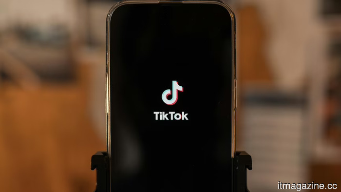 A study reveals that almost 60% of TikTok videos presented to new users consist of low-quality AI content.
A Kapwing analysis of 10,742 TikTok videos revealed that 59% of the content presented to new accounts consists of AI-generated material, which is three times higher than the rate seen on YouTube Shorts.
A study reveals that almost 60% of TikTok videos presented to new users consist of low-quality AI content.
A Kapwing analysis of 10,742 TikTok videos revealed that 59% of the content presented to new accounts consists of AI-generated material, which is three times higher than the rate seen on YouTube Shorts.
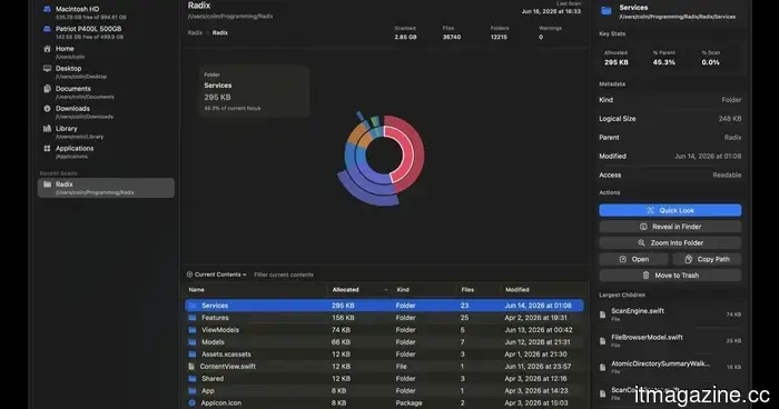 If you own a Mac, you ought to check out this free and aesthetically pleasing disk space utility.
Radix is a free and open-source application for Mac that analyzes folders or drives and displays storage utilization using an interactive sunburst chart.
If you own a Mac, you ought to check out this free and aesthetically pleasing disk space utility.
Radix is a free and open-source application for Mac that analyzes folders or drives and displays storage utilization using an interactive sunburst chart.
The Liquid Glass slider in iOS 27 appears straightforward, but it's actually more beneficial than I anticipated.
Having used iOS 27 on my iPhone for more than a week, I’ve discovered that the Liquid Glass slider is one of the most overlooked features of the update. Here’s how it functions and why you should give it a try.