
I can’t imagine my life without these features after spending hours on YouTube Shorts.
I am a frequent viewer of YouTube Shorts. I admit I'm not particularly proud of it, but the habit of doomscrolling has taken a strong grip on me, and I’m unsure how to break free.
However, spending so much time on Shorts has allowed me to notice certain annoyances. I've never liked the dislike button or the persistent bottom bar that appears while I'm trying to enjoy videos. These frustrations accumulate when I’m scrolling endlessly. Fortunately, this has improved recently — and for the better. YouTube has rolled out some new features for Shorts that have truly altered how I engage with the app.
Shorts shouldn’t be long
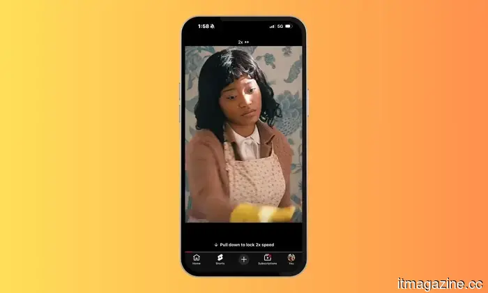
The first thing I did after the update was to customize my Shorts viewing experience. I’m not a fan of Shorts that run for two or even three minutes. They're designed to be short, yet some creators seem intent on stretching that definition. To be fair, several longer videos can be quite engaging. I don’t want to skip them midway through and miss something significant, but I also don’t want to watch them at normal speed when I’m in full doomscroll mode.
This is where the new double-speed playback feature comes in. I often watch longer Shorts at 2x speed. It allows me to consume the content much faster without feeling like I'm losing out. For someone who watches an excessive number of Shorts daily, this addition from YouTube has been incredibly beneficial. It feels like I’m absorbing the same information, just without the unnecessary delay.
Not interested ≠ I hated it
One aspect of YouTube Shorts I’ve never liked is the dislike button, as I rarely use it in the intended manner. Usually, it’s not that I dislike a video; I’m simply … not interested. It could be yet another football edit, celebrity gossip, or a review of a gadget that changed someone’s life. While someone else might enjoy it, it does nothing for me. That doesn’t mean the creator deserves a dislike; it just indicates that YouTube inaccurately assessed my interests.
That’s why I appreciate the removal of the dislike button from Shorts. It aligns better with how I’ve been using the app all this time. If a video doesn’t appeal to me, I just scroll past it. Plus, having one less button on the screen contributes to a cleaner interface while I’m watching.
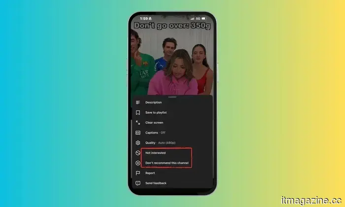
What I do value is what YouTube has introduced in its place. Instead of making me choose between liking or disliking a video, I now have the options of Not Interested or Don’t recommend this channel. This is much more practical for someone like me, whose interests can change day by day.
As for the new heart icon that replaces the thumbs-up, I don’t have any strong feelings about it. I still tap it for videos I like, just as before. Whether it’s a thumbs-up or a heart makes little difference in how I use Shorts. If anything, it gives the app a similar vibe to other short-video platforms.
The best change YouTube made was removing distractions
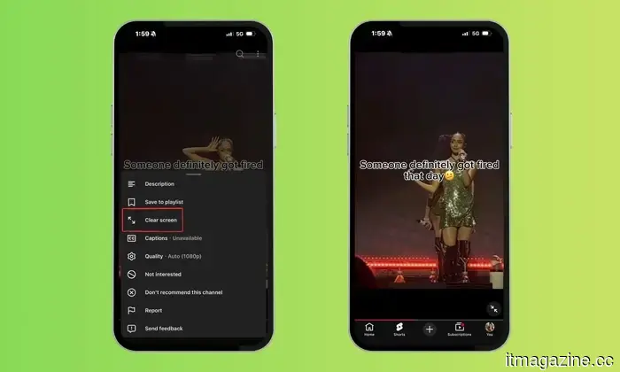
This is the feature I’ve been eagerly anticipating the most. When I’m watching a Short, my focus is on the video — not on a screen cluttered with buttons, captions, channel names, and other interface elements competing for my attention. There have been countless instances when a creator points to something at the edge of the frame or adds small text, only for it to be obscured by YouTube’s controls. That’s why the new Clear Screen mode feels like such a valuable addition. With just a tap, it temporarily conceals all icons and text, showcasing only the video.
Whether I’m viewing a travel clip featuring stunning scenery or a recipe where every ingredient is crucial, the distraction-free view is far more enjoyable. It allows the content to be the focus rather than YouTube’s controls. It’s one of those quality-of-life enhancements that may not sound thrilling, but once you start using it, you’ll wonder why it wasn’t implemented sooner.
Who knew that less could feel like more?
As someone who spends a considerable amount of time browsing YouTube Shorts daily, even the tiniest improvements in usability can have a significant impact. Even if you’re not someone who loses hours to doomscrolling like I do, you’ll appreciate these changes as soon as you open Shorts. Sometimes, enhancing an app isn’t about adding features — it’s about clearing the way for a better experience.
Other articles
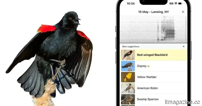 The Merlin Bird ID app is now aiming to create a worldwide database of our disappearing avian companions.
Merlin Bird ID will soon integrate AI-driven bird identifications into Cornell's eBird platform, assisting researchers in tracking bird populations through millions of actual observations.
The Merlin Bird ID app is now aiming to create a worldwide database of our disappearing avian companions.
Merlin Bird ID will soon integrate AI-driven bird identifications into Cornell's eBird platform, assisting researchers in tracking bird populations through millions of actual observations.
 The battery upgrade for the iPhone 18 Pro Max now appears to be almost certain.
The 3C certification database from China seems to indicate the battery capacities of the iPhone 18 Pro and Pro Max before Apple's autumn launch.
The battery upgrade for the iPhone 18 Pro Max now appears to be almost certain.
The 3C certification database from China seems to indicate the battery capacities of the iPhone 18 Pro and Pro Max before Apple's autumn launch.
 Minions & Monsters records the lowest franchise opening with $64 million.
Universal's newest Minions movie topped the July 4 weekend with $64 million, but it marks the lowest opening for a Despicable Me film, earning only half of what its predecessors made.
Minions & Monsters records the lowest franchise opening with $64 million.
Universal's newest Minions movie topped the July 4 weekend with $64 million, but it marks the lowest opening for a Despicable Me film, earning only half of what its predecessors made.
 The Australian government cautions physicians regarding the use of AI scribing tools due to increasing concerns about privacy and safety.
Australia is assessing the use of AI medical scribes as regulators express worries regarding patient privacy, consent, data security, and insufficient supervision in clinical environments.
The Australian government cautions physicians regarding the use of AI scribing tools due to increasing concerns about privacy and safety.
Australia is assessing the use of AI medical scribes as regulators express worries regarding patient privacy, consent, data security, and insufficient supervision in clinical environments.
 I can’t go without these features after spending countless hours on YouTube Shorts.
I find myself using YouTube Shorts more often than I care to admit, and these new features have truly transformed my viewing experience. It's likely that you'll enjoy them as well.
I can’t go without these features after spending countless hours on YouTube Shorts.
I find myself using YouTube Shorts more often than I care to admit, and these new features have truly transformed my viewing experience. It's likely that you'll enjoy them as well.
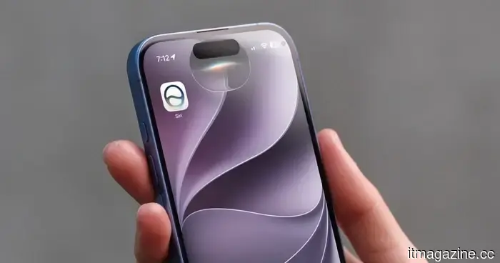 Three Siri AI features that have truly enhanced my daily routine.
From an improved Spotlight search to reminders in natural language and a camera that truly comprehends its surroundings, here are three Siri AI features that are significantly enhancing everyday iPhone usage.
Three Siri AI features that have truly enhanced my daily routine.
From an improved Spotlight search to reminders in natural language and a camera that truly comprehends its surroundings, here are three Siri AI features that are significantly enhancing everyday iPhone usage.
I can’t imagine my life without these features after spending hours on YouTube Shorts.
I find myself using YouTube Shorts more than I care to confess, and these new features have truly transformed my viewing experience. You’ll probably enjoy them as well.