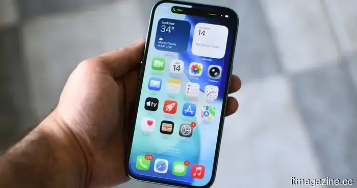
Apple has made Liquid Glass adjustable, which says a lot about Liquid Glass.
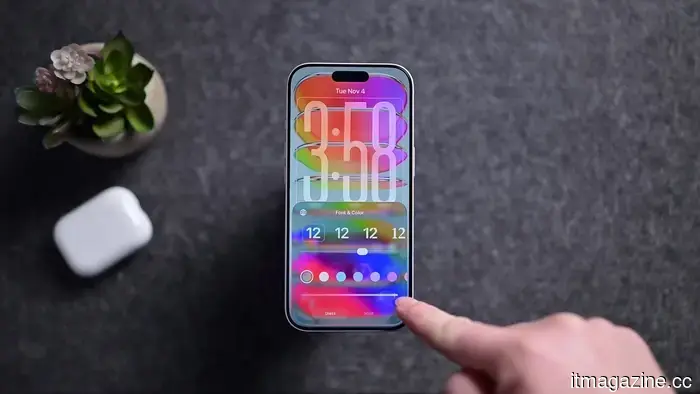
Apple's ambitious software vision now includes an option to reduce its sleekness. In iOS 27, users can modify the translucency of the Liquid Glass effect, while macOS Golden Gate introduces similar Liquid Glass settings in System Settings.
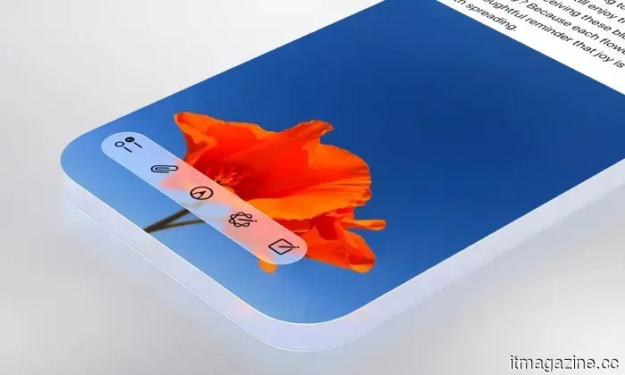
Liquid Glass continues to be a prominent feature across Apple's platforms, gracefully permeating menus and panels and showcasing the refined UI approach Apple favors. This significant visual innovation has now been equipped with a dimmer switch. After spending a year promoting translucency as a clear advancement, the most telling design update from WWDC may be the one that allows users to tone it down.
AppleInsider
The intersection of Apple's design confidence and readability
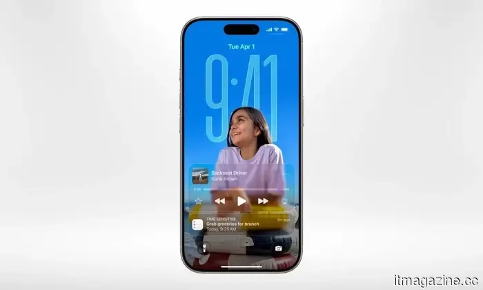
Liquid Glass was never merely an aesthetic enhancement. Apple presented it as a comprehensive visual language, designed to create a cohesive, premium experience that's unmistakably Apple. However, it faced the realities of actual screens. As software becomes increasingly translucent, it must contend with the chaotic elements beneath it, such as busy wallpapers, crowded notifications, and forgotten widgets.
Glassy interface design isn’t a secret method emerging from a concealed lab beneath Apple Park. Windows Vista featured Aero Glass back when laptops still had DVD drives; Microsoft later revived a frosted appearance with the Acrylic material in Fluent Design; and Apple itself experimented with translucency in iOS 7.
Liquid Glass might appear smoother, richer, and more technically sophisticated, but the fundamental principle remains unchanged: make software look luxurious, then spend subsequent releases ensuring users can see what's behind it.
Apple
Complaints regarding readability weren't unfounded. Reddit users and design-focused commentators had already pointed out issues like low contrast, notifications becoming hard to read, and text clashing with the background. A glassy UI looks appealing until the background starts to interfere.
However, the new adjustment slider turns that friction into a customizable option. Apple still aims for Liquid Glass to be ubiquitous; it just seems to recognize that not every display requires the full aquarium effect. This feels like the appropriate middle ground for a design system centered on transparency, as transparency retains its charm until the elements behind it begin to clash with those in front.
Why this escape option is vital
Referring to it as a "less Liquid Glass" button is simplistic, accurate, and perhaps somewhat unfair. Apple made a wise decision.
A visual system as bold as this should include an escape option before the interface someone is trying to interact with starts resembling a luxury shower door.
Apple
On macOS Golden Gate, users can adjust the effect to be clearer, more opaque, or somewhere in between, with the more opaque version enhancing text legibility. This is preferable to requiring everyone to conform to the same glossy aesthetic indefinitely. Apple can maintain its design confidence while allowing users to read menus without negotiating with a wallpaper.
When does polish become a nuisance?
Modern software often pursues visual refinement until that polish becomes another hurdle to navigate.
It may look stunning during a keynote presentation but becomes less impressive when someone is trying to read a menu in daylight. Screens aren’t merely display items; they serve as tools for individuals to complete everyday tasks without the interface transforming each interaction into a design showcase.
Apple didn’t eliminate the design; instead, it provided users with a subtle, elegant way to strain their eyes less, which might turn out to be the finest feature of Liquid Glass.
It may not be the flashiest feature, but that was somewhat the issue.
Other articles
 Apple has finally laid to rest the rumors surrounding planned obsolescence.
Each iOS update often brought the same concern: my older iPhone might slow down. iOS 27 finally changes that trend, and it’s significant.
Apple has finally laid to rest the rumors surrounding planned obsolescence.
Each iOS update often brought the same concern: my older iPhone might slow down. iOS 27 finally changes that trend, and it’s significant.
 A Tesla operating on Autopilot veered into a garage door in Washington. Authorities are looking into the incident.
A driver in Redmond, Washington, claims that Tesla's self-driving feature failed just before the vehicle crashed through a garage door of a residence. No injuries have been reported.
A Tesla operating on Autopilot veered into a garage door in Washington. Authorities are looking into the incident.
A driver in Redmond, Washington, claims that Tesla's self-driving feature failed just before the vehicle crashed through a garage door of a residence. No injuries have been reported.
 KPMG retracted its AI report after UBS, the NHS, and others stated that its assertions regarding them were fabricated.
KPMG retracted a report on agentic AI after several organizations disputed the accuracy of its statements regarding their AI use. GPTZero attributed the inaccuracies to AI hallucinations.
KPMG retracted its AI report after UBS, the NHS, and others stated that its assertions regarding them were fabricated.
KPMG retracted a report on agentic AI after several organizations disputed the accuracy of its statements regarding their AI use. GPTZero attributed the inaccuracies to AI hallucinations.
 Brazil's hidden World Cup asset trained the team on when to disregard it.
Brazil's GPS vests nearly sidelined a star player due to inaccurate data. This is the reason the figures were flawed.
Brazil's hidden World Cup asset trained the team on when to disregard it.
Brazil's GPS vests nearly sidelined a star player due to inaccurate data. This is the reason the figures were flawed.
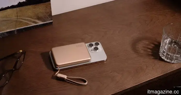 Replace Your Bulky Power Bank with SnapGo Air for Easier Charging
Charge your phone efficiently with the smart choice. This Spring Offer from INIU has the SnapGo Air (P781) available for only $49.99. Replace your bulky power bank with a streamlined magnetic snap-on that charges your device effortlessly, eliminating cables and clutter that could hold you back.
Replace Your Bulky Power Bank with SnapGo Air for Easier Charging
Charge your phone efficiently with the smart choice. This Spring Offer from INIU has the SnapGo Air (P781) available for only $49.99. Replace your bulky power bank with a streamlined magnetic snap-on that charges your device effortlessly, eliminating cables and clutter that could hold you back.
 Apple has made Liquid Glass adjustable, which speaks volumes about its capabilities.
Apple introduced a Liquid Glass slider to iOS 27 and macOS Golden Gate, and the most amusing aspect is how practical it appears.
Apple has made Liquid Glass adjustable, which speaks volumes about its capabilities.
Apple introduced a Liquid Glass slider to iOS 27 and macOS Golden Gate, and the most amusing aspect is how practical it appears.
Apple has made Liquid Glass adjustable, which says a lot about Liquid Glass.
Apple introduced a Liquid Glass slider in iOS 27 and macOS Golden Gate, and the amusing aspect is how practical it seems.