
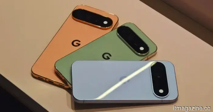
I have a weakness for vibrant phones, and Google is well aware of this.
Color has a peculiar way of seizing my attention. It could be a vibrant bouquet of flowers, a colorful bottle on a shelf, a quirky piece of home decor, or even the small detail of a pair of earbuds. I approach phones with the same mindset; if a phone comes in an interesting color, I’ll likely notice it first.
Phone manufacturers seem to be aware of this as well. Apple has been incorporating colorful iPhones for years, with the iPhone 5c being a notable early example. Google has also embraced color with its Pixel series, particularly since the Pixel 5 era. Over time, I've come to feel that Google excels in phone colors more than most others. They don’t just apply a bright hue to the back and call it a day; their colors often have character. This sentiment was reinforced when Google showcased the Pixel 11 series at its Made by Google event. The colors immediately stood out to me, reminding me of why Pixel colors rank among my favorites in the industry.
The Pixels are anything but understated.
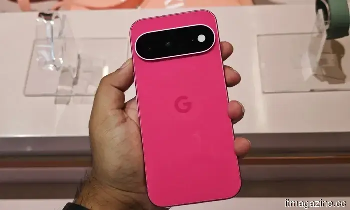
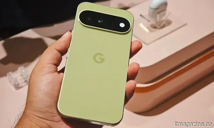
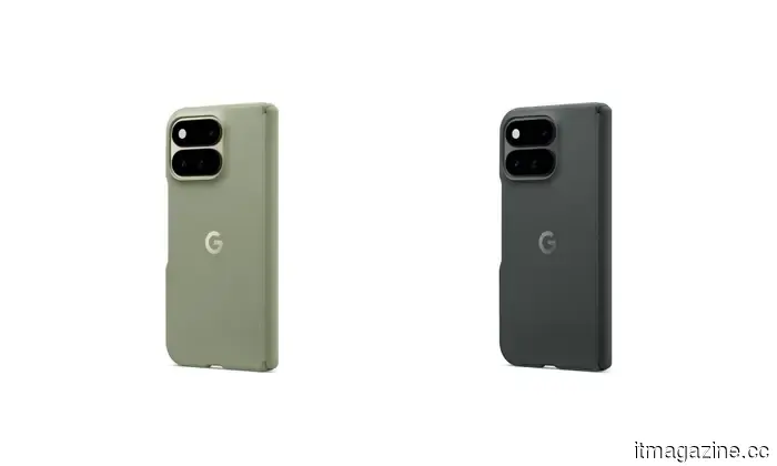
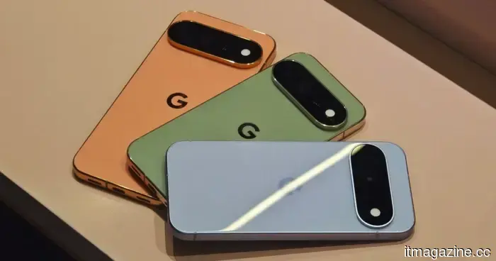
This year, Google has introduced four Pixel phones: the Pixel 11, Pixel 11 Pro, Pixel 11 Pro XL, and Pixel 11 Pro Fold. What I appreciate is that Google hasn’t relegated color to an afterthought. There’s substantial personality within the lineup, whether you prefer something that blends in or a phone that boldly stands out when you take it out of your pocket. The Pixel 11 is undoubtedly the most playful model, available in Frost, Hibiscus, Obsidian, or Pistachio. In contrast, the Pixel 11 Pro and Pixel 11 Pro XL are offered in slightly more sophisticated shades like Canyon, Olive, Fog, and Obsidian. The Pixel 11 Pro Fold opts for simplicity, presenting just Olive and Obsidian. So, while Google tends to reserve its more adventurous colors for the standard Pixel, at least the Pro models avoid being limited to various shades of gray.
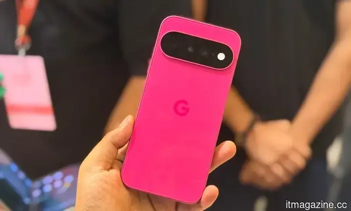
And then there’s Hibiscus. Oh, Hibiscus. This is definitely the color I would choose this year. It instantly brings to mind the iPhone 17 Pro’s Cosmic Orange, sharing the same unapologetically vibrant vibe. These are phones that refuse to fade into a black case or sit quietly on a table; they thrive on visibility. Hibiscus, in particular, is a color I can visualize spotting from across a room, instantly recognizing which phone it belongs to. Criticize my taste if you wish, but subtlety has never been my forte.
That’s precisely why I admire what Google is doing. Look around the Android landscape, and you'll see numerous beautiful smartphones, yet many manufacturers still play it extremely safe with colors like black, white, silver, gray, and the occasional dark blue. While they may look premium, over time they can blur together. Pixels rarely face this issue. Even the softer tones exhibit some character, while colors like Hibiscus and Pistachio genuinely stand out. They are bright, fun, and instantly identifiable without making the phones seem cheap. Amid a sea of increasingly serious smartphones, Google seems content to let its Pixels shine a bit brighter, and I fully support this.
Everything is color-coordinated for you.
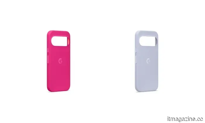
Google has carried this vibrant energy over to its official cases, a detail that I appreciate more than I anticipated. If you fall for the Hibiscus Pixel 11, as I clearly have, there’s no need to hide that personality under a dull black or gray case. Google offers a matching Hibiscus case, allowing you to protect your phone without losing the look you initially loved.
Whenever a smartphone brand introduces a striking or unique color, finding a case that complements it can be challenging. You might have several case options, but they often end up being black, gray, navy blue, or another shade that doesn’t quite match the phone. If you want to keep that beautiful color visible, the go-to solution is usually a transparent case.
I’ve traversed that path many times and am not particularly fond of it. A clear case may look fantastic initially, providing protection without obscuring the phone, but over time, dirt collects along the edges, fingerprints become more visible, and some clear cases eventually start to appear yellowed and worn. Suddenly, the stunning phone you wanted to showcase doesn’t look nearly as appealing. Then you go and buy another clear case, restarting the cycle.
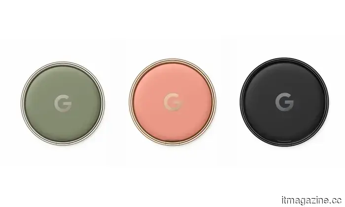
That’s why I appreciate Google’s approach. If I’m purchasing the Hibiscus Pixel 11, I can select the matching case and maintain that vibrant appearance. Google doesn’t stop with cases; even the Pixel Ring Stand incorporates some color this year, with options in Canyon, Olive, and Black. This means you can mix and match accessories to coordinate with your phone and case instead of pairing a vivid Pixel with a bunch of mundane accessories. It’s a minor detail, but it contributes to the entire lineup feeling more thoughtfully designed. Google is not
Otros artículos
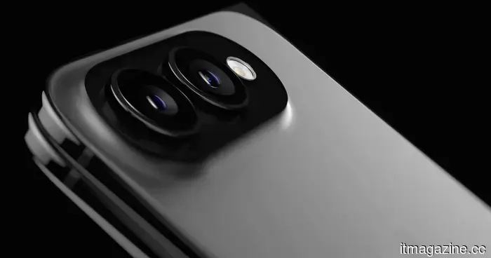 El iPhone Ultra plegable podría decepcionar a un montón de compradores ansiosos.
Títulos descriptivos alternativos El iPhone Ultra podría lanzarse primero en EE. UU. mientras Apple enfrenta problemas de suministro y producción El primer iPhone plegable de Apple podría tener un lanzamiento internacional muy limitado Los problemas de suministro del iPhone Ultra podrían dejar a algunos países esperando meses Apple podría presentar el iPhone Ultra antes de que esté listo para un lanzamiento global completo Las escaseces del iPhone plegable podrían hacer que el iPhone Ultra sea difícil de comprar en el lanzamiento Apple podría priorizar EE. UU. para la primera ola de ventas del iPhone Ultra El lanzamiento del iPhone Ultra podría retrasarse en algunos mercados a pesar de una presentación en septiembre El iPhone plegable de Apple podría llegar en etapas a medida que el suministro siga siendo limitado Opciones de extracto El primer iPhone plegable de Apple podría lanzarse primero en EE. UU., con problemas de suministro, precios y producción que podrían retrasar la disponibilidad en otros mercados. Se rumorea que el iPhone Ultra podría ser presentado este otoño, pero seguiría siendo difícil de comprar, con algunos países potencialmente esperando meses por stock. Apple podría enfrentar un lanzamiento muy limitado para su primer iPhone plegable, ya que los problemas de producción y suministro amenazan la disponibilidad más amplia. El iPhone Ultra podría llegar a EE. UU. antes que a otros mercados importantes, a pesar del gran interés en el primer diseño plegable de Apple. Palabras clave de enfoque iPhone Ultra iPhone plegable lanzamiento del iPhone Ultra disponibilidad del iPhone Ultra suministro del iPhone Ultra lanzamiento del iPhone plegable iPhone plegable de Apple lanzamiento del iPhone Ultra en EE. UU. Mejor frase clave de enfoque: disponibilidad del iPhone Ultra Opciones de título SEO El iPhone Ultra podría lanzarse primero en EE. UU. El iPhone Ultra podría enfrentar disponibilidad limitada en el lanzamiento El iPhone plegable de Apple podría ser difícil de comprar en el lanzamiento Los problemas de suministro del iPhone Ultra podrían retrasar el lanzamiento global El iPhone plegable podría lanzarse en EE. UU. antes que en otros mercados El iPhone Ultra podría enfrentar retrasos de meses en algunos países El lanzamiento del iPhone Ultra de Apple podría estar limitado por problemas de suministro Combinación recomendada más fuerte Título descriptivo alternativo: El iPhone Ultra podría lanzarse primero en EE. UU. mientras Apple enfrenta problemas de suministro y producción Extracto: El primer iPhone plegable de Apple podría lanzarse primero en EE. UU., con problemas de suministro, precios y producción que podrían retrasar la disponibilidad en otros mercados. Frase clave de enfoque: disponibilidad del iPhone Ultra Título SEO: El iPhone Ultra podría enfrentar disponibilidad limitada en el lanzamiento Hacer que el extracto sea: Apple enfrenta problemas de suministro que podrían obstaculizar la disponibilidad de su próximo plegable. Se espera que solo un número limitado de dispositivos llegue primero al mercado de EE. UU., mientras que otras regiones podrían tener que esperar meses para su disponibilidad. Apple enfrenta problemas de suministro que podrían obstaculizar la disponibilidad de su próximo iPhone plegable. Se espera que un número limitado de dispositivos llegue primero a EE. UU., mientras que los compradores en otras regiones podrían tener que esperar meses para su disponibilidad. Hacerlo más corto Apple enfrenta problemas de suministro que podrían limitar su iPhone plegable a EE. UU. inicialmente, dejando a otras regiones esperando meses.
El iPhone Ultra plegable podría decepcionar a un montón de compradores ansiosos.
Títulos descriptivos alternativos El iPhone Ultra podría lanzarse primero en EE. UU. mientras Apple enfrenta problemas de suministro y producción El primer iPhone plegable de Apple podría tener un lanzamiento internacional muy limitado Los problemas de suministro del iPhone Ultra podrían dejar a algunos países esperando meses Apple podría presentar el iPhone Ultra antes de que esté listo para un lanzamiento global completo Las escaseces del iPhone plegable podrían hacer que el iPhone Ultra sea difícil de comprar en el lanzamiento Apple podría priorizar EE. UU. para la primera ola de ventas del iPhone Ultra El lanzamiento del iPhone Ultra podría retrasarse en algunos mercados a pesar de una presentación en septiembre El iPhone plegable de Apple podría llegar en etapas a medida que el suministro siga siendo limitado Opciones de extracto El primer iPhone plegable de Apple podría lanzarse primero en EE. UU., con problemas de suministro, precios y producción que podrían retrasar la disponibilidad en otros mercados. Se rumorea que el iPhone Ultra podría ser presentado este otoño, pero seguiría siendo difícil de comprar, con algunos países potencialmente esperando meses por stock. Apple podría enfrentar un lanzamiento muy limitado para su primer iPhone plegable, ya que los problemas de producción y suministro amenazan la disponibilidad más amplia. El iPhone Ultra podría llegar a EE. UU. antes que a otros mercados importantes, a pesar del gran interés en el primer diseño plegable de Apple. Palabras clave de enfoque iPhone Ultra iPhone plegable lanzamiento del iPhone Ultra disponibilidad del iPhone Ultra suministro del iPhone Ultra lanzamiento del iPhone plegable iPhone plegable de Apple lanzamiento del iPhone Ultra en EE. UU. Mejor frase clave de enfoque: disponibilidad del iPhone Ultra Opciones de título SEO El iPhone Ultra podría lanzarse primero en EE. UU. El iPhone Ultra podría enfrentar disponibilidad limitada en el lanzamiento El iPhone plegable de Apple podría ser difícil de comprar en el lanzamiento Los problemas de suministro del iPhone Ultra podrían retrasar el lanzamiento global El iPhone plegable podría lanzarse en EE. UU. antes que en otros mercados El iPhone Ultra podría enfrentar retrasos de meses en algunos países El lanzamiento del iPhone Ultra de Apple podría estar limitado por problemas de suministro Combinación recomendada más fuerte Título descriptivo alternativo: El iPhone Ultra podría lanzarse primero en EE. UU. mientras Apple enfrenta problemas de suministro y producción Extracto: El primer iPhone plegable de Apple podría lanzarse primero en EE. UU., con problemas de suministro, precios y producción que podrían retrasar la disponibilidad en otros mercados. Frase clave de enfoque: disponibilidad del iPhone Ultra Título SEO: El iPhone Ultra podría enfrentar disponibilidad limitada en el lanzamiento Hacer que el extracto sea: Apple enfrenta problemas de suministro que podrían obstaculizar la disponibilidad de su próximo plegable. Se espera que solo un número limitado de dispositivos llegue primero al mercado de EE. UU., mientras que otras regiones podrían tener que esperar meses para su disponibilidad. Apple enfrenta problemas de suministro que podrían obstaculizar la disponibilidad de su próximo iPhone plegable. Se espera que un número limitado de dispositivos llegue primero a EE. UU., mientras que los compradores en otras regiones podrían tener que esperar meses para su disponibilidad. Hacerlo más corto Apple enfrenta problemas de suministro que podrían limitar su iPhone plegable a EE. UU. inicialmente, dejando a otras regiones esperando meses.
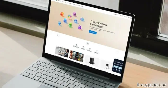 Microsoft quiere que dejes de usar contraseñas por SMS, ya que la IA hace que sea más difícil detener el phishing.
Microsoft está advirtiendo a los administradores de TI que abandonen la autenticación por SMS y voz porque el phishing con IA está facilitando su explotación. Aquí está la línea de tiempo completa para el cambio a las claves de acceso.
Microsoft quiere que dejes de usar contraseñas por SMS, ya que la IA hace que sea más difícil detener el phishing.
Microsoft está advirtiendo a los administradores de TI que abandonen la autenticación por SMS y voz porque el phishing con IA está facilitando su explotación. Aquí está la línea de tiempo completa para el cambio a las claves de acceso.
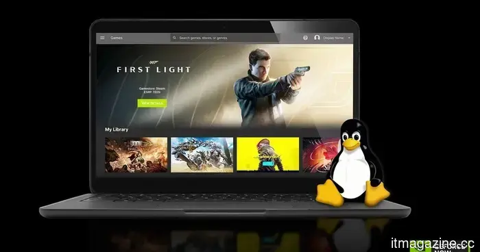 La GeForce Now de Nvidia sale de beta en Linux con un rendimiento mejorado en juegos en la nube.
La aplicación nativa de Linux de GeForce NOW de Nvidia salió de beta después de siete meses, añadiendo streaming más rápido, soporte para Chromebook y nueve nuevos juegos en la nube.
La GeForce Now de Nvidia sale de beta en Linux con un rendimiento mejorado en juegos en la nube.
La aplicación nativa de Linux de GeForce NOW de Nvidia salió de beta después de siete meses, añadiendo streaming más rápido, soporte para Chromebook y nueve nuevos juegos en la nube.
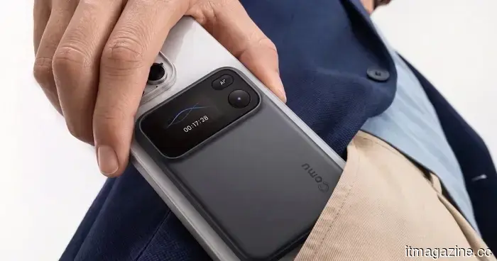 El pequeño grabador de IA de Comu puede convertir tus reuniones en diapositivas, correos electrónicos y planes de acción.
El nuevo Action Pro de Comu puede grabar y transcribir reuniones, luego usar IA para generar diapositivas editables, correos electrónicos de seguimiento, documentos y planes de acción.
El pequeño grabador de IA de Comu puede convertir tus reuniones en diapositivas, correos electrónicos y planes de acción.
El nuevo Action Pro de Comu puede grabar y transcribir reuniones, luego usar IA para generar diapositivas editables, correos electrónicos de seguimiento, documentos y planes de acción.
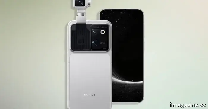 El teléfono robot de Honor ya está disponible, y puede ser el teléfono con cámara más ambicioso hasta ahora.
El teléfono robot de Honor combina hardware de gama alta con una cámara de 200 MP montada en un gimbal motorizado, seguimiento de sujetos impulsado por IA y tecnología de imagen desarrollada con ARRI. También viene con un precio realmente premium.
El teléfono robot de Honor ya está disponible, y puede ser el teléfono con cámara más ambicioso hasta ahora.
El teléfono robot de Honor combina hardware de gama alta con una cámara de 200 MP montada en un gimbal motorizado, seguimiento de sujetos impulsado por IA y tecnología de imagen desarrollada con ARRI. También viene con un precio realmente premium.
 Tamizando los Píxeles: Detectando Medios Generados por IA en 2026
El mundo digital está presenciando actualmente un aflujo de medios creados sintéticamente. El arte, el video, incluso la música y las películas de formato corto están siendo generados por modelos de IA. Y aunque las primeras imágenes generadas por IA eran a menudo fáciles de identificar debido a varios (y a menudo divertidos) errores anatómicos, los últimos modelos están produciendo resultados que pueden pasar más fácilmente la prueba. […]
Tamizando los Píxeles: Detectando Medios Generados por IA en 2026
El mundo digital está presenciando actualmente un aflujo de medios creados sintéticamente. El arte, el video, incluso la música y las películas de formato corto están siendo generados por modelos de IA. Y aunque las primeras imágenes generadas por IA eran a menudo fáciles de identificar debido a varios (y a menudo divertidos) errores anatómicos, los últimos modelos están produciendo resultados que pueden pasar más fácilmente la prueba. […]
I have a weakness for vibrant phones, and Google is well aware of this.
The colors of Google’s Pixel 11 are vibrant, striking, and delightfully playful, and the accessories are also joining in on the excitement.