I long for the days when technology appeared inexpensive, plastic, and genuine.
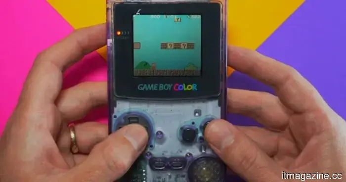
While I was switching between retro games on my Anbernic RG353V, I realized that I missed something unexpected: the appearance of inexpensive gadgets.
I’m not referring to faulty tech or romanticizing the past when devices had leaking batteries and screens you could barely see. Rather, I mean gadgets that were straightforward. The controls were apparent. The plastic casing didn’t try to pass off as high-end. The ports were visible, not concealed within a sleek design. This simplicity is exactly why I chose this Game Boy Color revival.
It may not earn design accolades, but it’s genuine, and it makes sense to me.
When buttons still resembled buttons
That kind of tangible clarity used to be commonplace. A Game Boy Color didn’t need to imply “interaction model.” It had a D-pad, face buttons, a cartridge slot, and seams that made it feel like a compact device designed for human hands. You could see it and instantly understand what needed to be pressed, opened, swapped, or connected.
Modern devices often take the opposite approach. Phones became sleek glass rectangles. Earbuds morphed into tiny glossy shapes. Laptops turned into thin metal slabs with fewer ports and minimal tactile indications.
To be fair, there are valid reasons for some of this: slimmer designs, cleaner appearances, improved durability, and better water resistance. However, they often appear costlier while feeling less user-friendly.
Somewhere along the line, “premium” became synonymous with “conceal the gadget.”
When clear plastic made technology feel alive
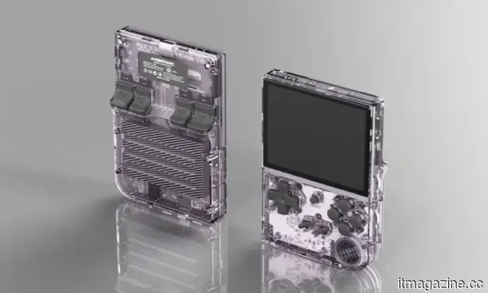
Clear plastic still seems strangely radical for that reason. Those transparent shells from the ’90s were inexpensive, eye-catching, and totally unsubtle, but they allowed the internal components to be visible. You could see layers, screws, circuit boards, and quirky sci-fi elements. Even if the transparency was more superficial than functional, it gave the device a playful vibe rather than a sealed-off one.
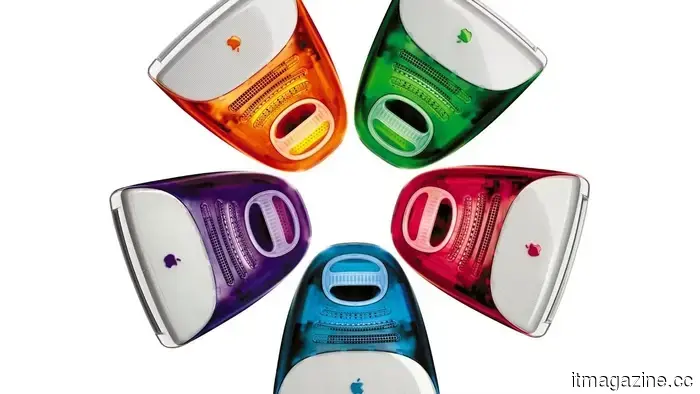
That desire hasn’t faded. Nowadays, transparency isn’t utilized to make phones and earbuds feel less anonymous. Playdate transforms a small yellow handheld and a crank into a distinct personality. CMF by Nothing embraces color, modular elements, and exposed controls. Apple’s colorful iMac revival seemed like a small breach in the dominance of silver and space gray.
I don’t look at such products and think the past triumphed. I just believe many of today’s gadgets could benefit from being a bit more relaxed.
When inexpensive meant understandable
Cheap-looking technology wasn’t always deliberately charming. Sometimes it looked low-cost simply because it was. The plastic would creak, colors would fade, and hinges would loosen after enough use. Some products had the design confidence of a toy found at a pharmacy checkout.
But that was part of their charm. They resembled tools, toys, and small machines instead of lifestyle accessories. They offered handles, slots, ridges, switches, and visual cues that encouraged you to use them. Modern tech often feels like it wants to belong in a showroom rather than a backpack.
That’s what my Anbernic reminded me of. I don’t need every device to return to being transparent purple, though I wouldn't mind it. I just miss when technology didn’t feel like it was trying to impress in an upscale hotel lobby and instead embraced its nature as a gadget.
Other articles
 Valorant's anti-cheat has rendered certain pricey cheat hardware ineffective.
Riot has provided details on how the latest Vanguard update addresses DMA-based cheating hardware by strengthening memory protections at the hardware level. While this enforcement may deter sophisticated cheaters, it has also sparked concerns regarding potential overreach in anti-cheat measures.
Valorant's anti-cheat has rendered certain pricey cheat hardware ineffective.
Riot has provided details on how the latest Vanguard update addresses DMA-based cheating hardware by strengthening memory protections at the hardware level. While this enforcement may deter sophisticated cheaters, it has also sparked concerns regarding potential overreach in anti-cheat measures.
 Microsoft will allow users to turn off the floating Copilot button in the Office application.
In the final week of May 2026, Microsoft will be releasing an Office update that allows users to relocate the floating Copilot button from their documents back to the ribbon.
SpaceX's IPO submission highlights a contradiction in Musk's clean energy approach, as xAI consumes gas while Tesla offers solar solutions.
xAI invested $2.8 billion in gas turbines, while Tesla offers solar panels. SpaceX's S-1 promotes space-based solar energy as the solution, but the calculations are still not conclusive.
Microsoft will allow users to turn off the floating Copilot button in the Office application.
In the final week of May 2026, Microsoft will be releasing an Office update that allows users to relocate the floating Copilot button from their documents back to the ribbon.
SpaceX's IPO submission highlights a contradiction in Musk's clean energy approach, as xAI consumes gas while Tesla offers solar solutions.
xAI invested $2.8 billion in gas turbines, while Tesla offers solar panels. SpaceX's S-1 promotes space-based solar energy as the solution, but the calculations are still not conclusive.
 SpaceX's IPO submission highlights a contradiction in Musk's clean energy approach, as xAI consumes gas while Tesla markets solar energy.
xAI invested $2.8 billion in gas turbines, whereas Tesla offers solar panels. SpaceX's S-1 proposes that solar power from space is the solution, but the calculations still don't align.
SpaceX's IPO submission highlights a contradiction in Musk's clean energy approach, as xAI consumes gas while Tesla markets solar energy.
xAI invested $2.8 billion in gas turbines, whereas Tesla offers solar panels. SpaceX's S-1 proposes that solar power from space is the solution, but the calculations still don't align.
 Why I have mixed feelings about portable monitors, despite my strong desire to have one.
I’d like to poke fun at portable monitors, but the frustrating reality is that they actually have their merits. That might be the most unfortunate aspect of them.
Why I have mixed feelings about portable monitors, despite my strong desire to have one.
I’d like to poke fun at portable monitors, but the frustrating reality is that they actually have their merits. That might be the most unfortunate aspect of them.
I long for the days when technology appeared inexpensive, plastic, and genuine.
Old plastic devices were bulky, odd, and at times unattractive, yet they possessed a tactile clarity that contemporary technology continuously smooths out.